France · 48.8566°, 2.3522°
Paris Map Poster: Framing, Districts, and Style
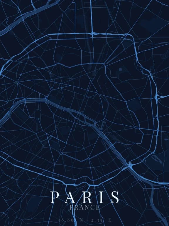
Why this city works as a poster
Paris has two structures layered on top of each other, and both read well as linework: the Seine, cutting the city east to west in a wide curve, and the Haussmann avenues radiating from circular squares. The result is neither a regular grid nor a mess: it is a network of stars joined by straight axes, a geometry the eye recognises instantly, with no street names needed.
Recommended framing
A frame covering the twenty arrondissements, roughly 10 km across, shows the full spiral and the bend of the Seine. It is the most recognisable framing. For a gift tied to a specific place, drop to 2 km: at that scale the star junctions at Etoile, Nation, or Republique become the subject of the poster.
Which theme to pick
Dark themes suit Paris particularly well: a dark ground makes the density of the network legible, and the Seine stands out as a single bright line. On a light theme the central city turns into an almost uniform block, the street mesh is that dense.
Where to centre the map
- Île de la Cité
- The city's point of origin. A 1 km frame isolates the two islands and the bridges — a very graphic composition.
- Montmartre
- Streets here follow the slope rather than a plan: the grid visibly breaks, which contrasts with the rest of the map.
- Canal Saint-Martin
- A crisp line of water in the north-east, useful when you want water without framing on the Seine.
How its streets are oriented
Within 3 km of the centre, we measured the orientation of 498 km of streets. Its orientation order is 0.05 out of 1: Paris ranks 42nd of the 64 cities in the study and 13th of the 25 French cities.
The streets run in almost every direction: no axis dominates, the pattern is organic.
See the full study: street orientation in 64 cities