France · 44.8378°, -0.5792°
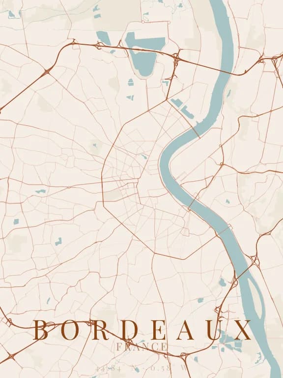
Bordeaux Map Poster: The Garonne Crescent
Why this city works as a poster
The Garonne traces a curve in front of Bordeaux so regular that it gave the city its nickname, the port of the Moon. On a map that curve does all the compositional work: it crosses the poster diagonally and separates two different urban fabrics, the dense old left bank and the looser right bank.
Recommended framing
A 6 to 7 km frame is enough: any wider and the curve flattens out and loses its effect. Set the poster in portrait and place the curve diagonally rather than horizontally, which makes the composition noticeably more dynamic.
Which theme to pick
Light themes work well here, unlike in Paris: the Bordeaux fabric is less dense, streets stay distinct on a light ground, and the river keeps its legibility.
Where to centre the map
- Place de la Bourse
- On the left bank at the deepest point of the curve: a good centring point.
- Chartrons
- A regular grid in bands parallel to the river, very legible in fine linework.
- Bastide
- Right bank, more open: useful to balance a poster that is too heavy on the left.
How its streets are oriented
Within 3 km of the centre, we measured the orientation of 475 km of streets. Its orientation order is 0.02 out of 1: Bordeaux ranks 59th of the 64 cities in the study and 21st of the 25 French cities.
The streets run in almost every direction: no axis dominates, the pattern is organic.
See the full study: street orientation in 64 cities